
Selected work / Brand & campaign
Punta Cana, D.R.AzureaResidences
A coastal identity.
A considered collection.
01 / The direction
An identity shaped
by the coast.
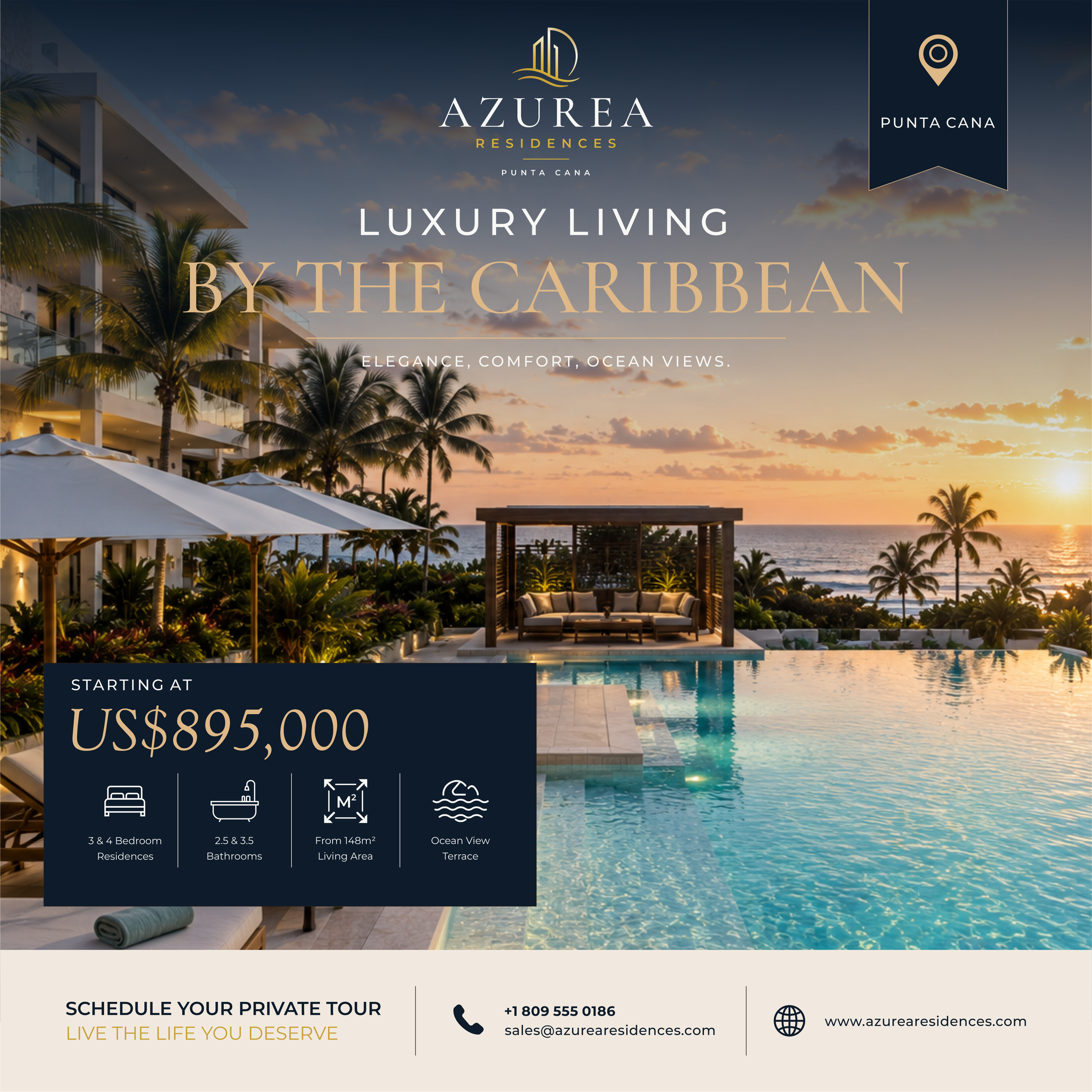
Deep navy, warm gold, and elegant serif typography set the tone for Azurea. Architectural imagery and generous space carry that identity across a collection of real estate promotional designs.
- Project
- Azurea Residences
- Discipline
- Visual identity & marketing design
- Collection
- Brand guide + five campaign pieces
 View artwork ↗
02 / The foundation
Quiet confidence.
A distinct signature.
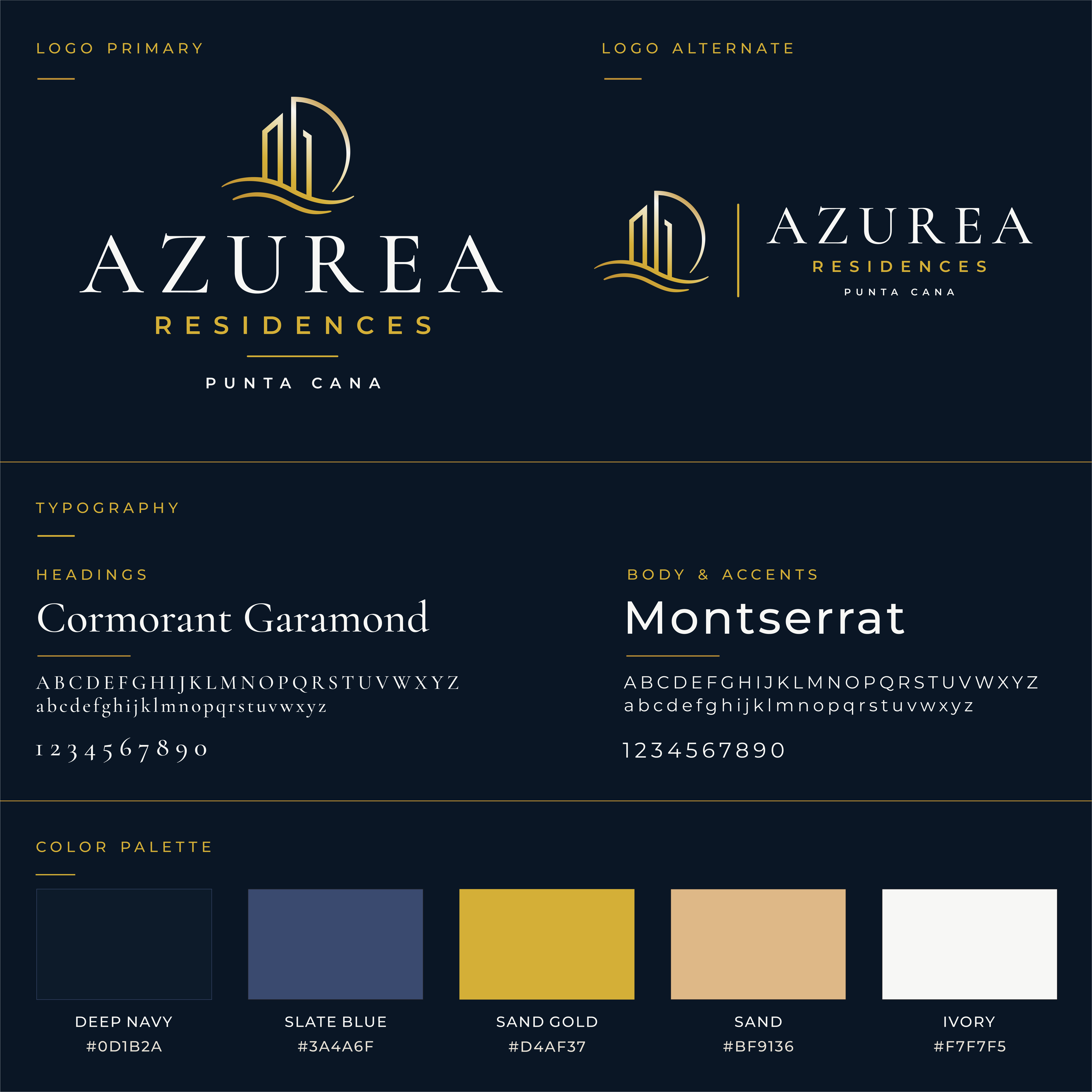
The primary and alternate marks, a coastal palette, and a complementary type pairing form the visual language behind the collection.
The palette
The typography
Cormorant
Garamond
MONTSERRAT
Expressive headlines.
Clear, measured supporting type.
 Explore brand guide ↗
03 / The campaign
One language.
Different proportions.
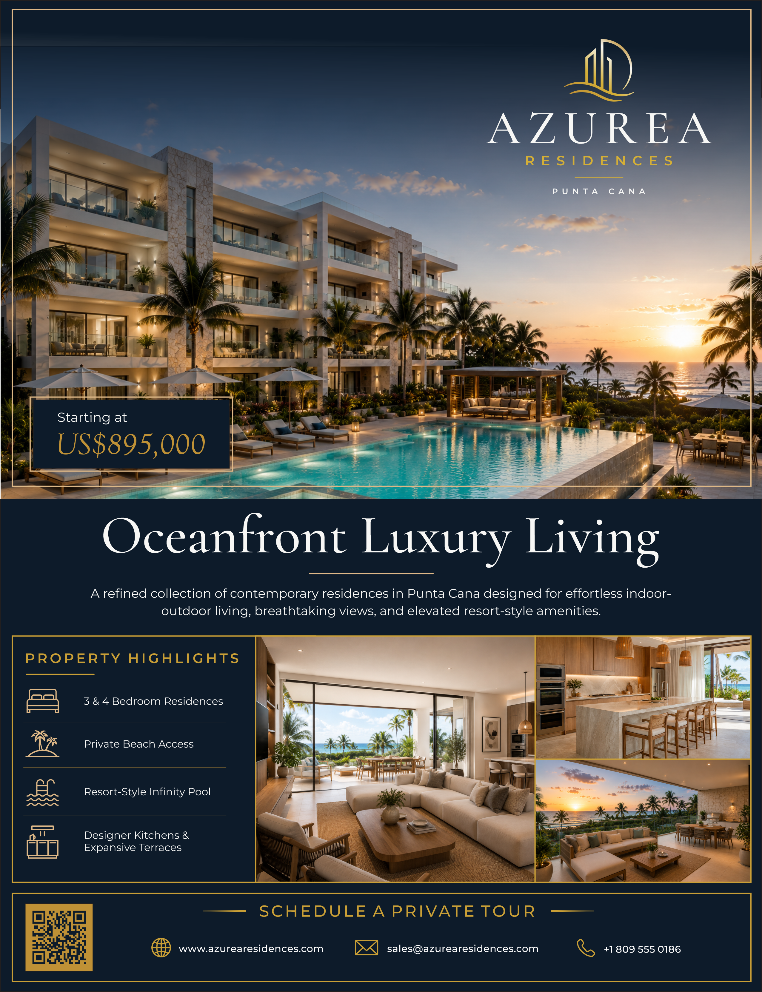
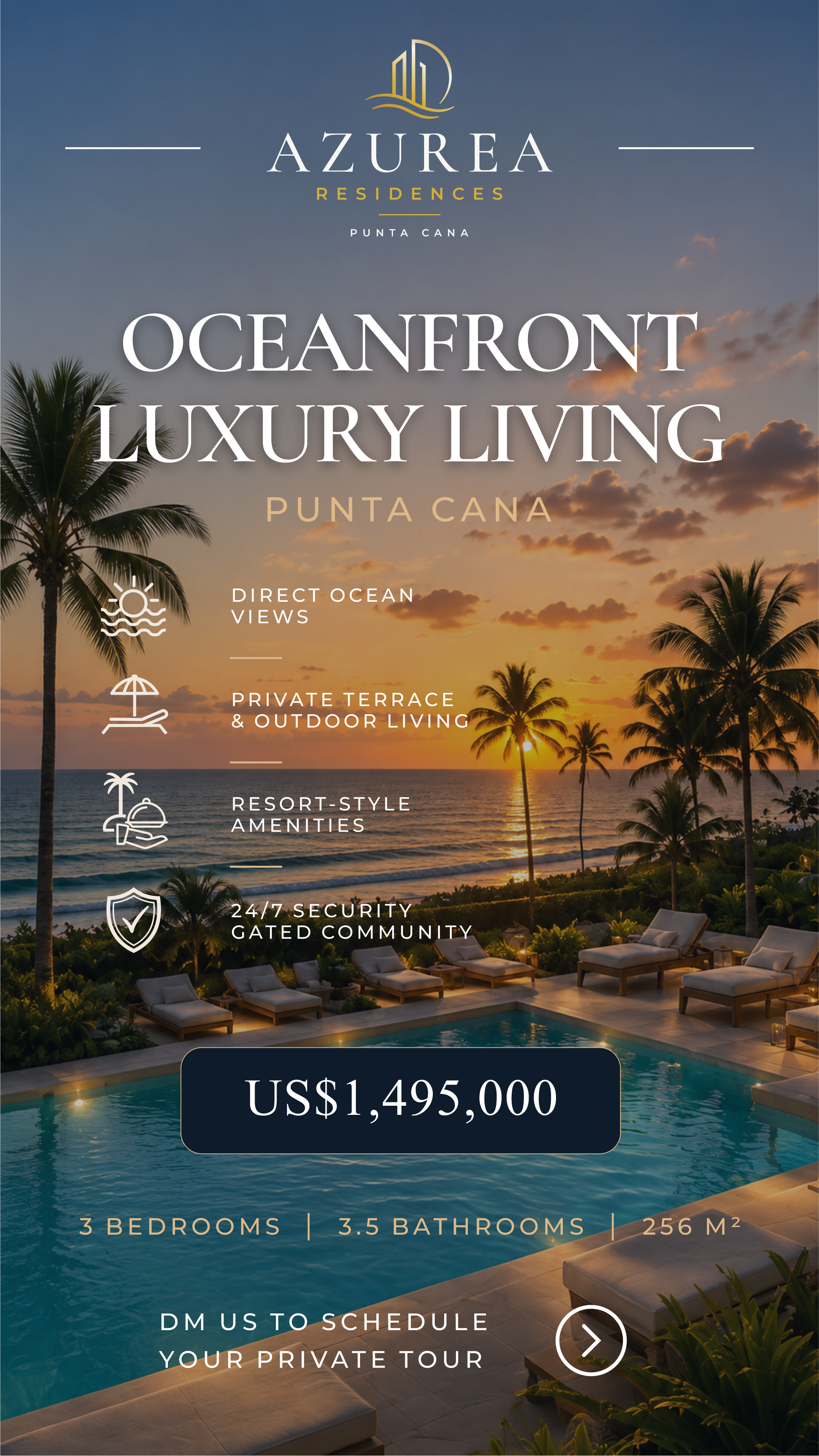
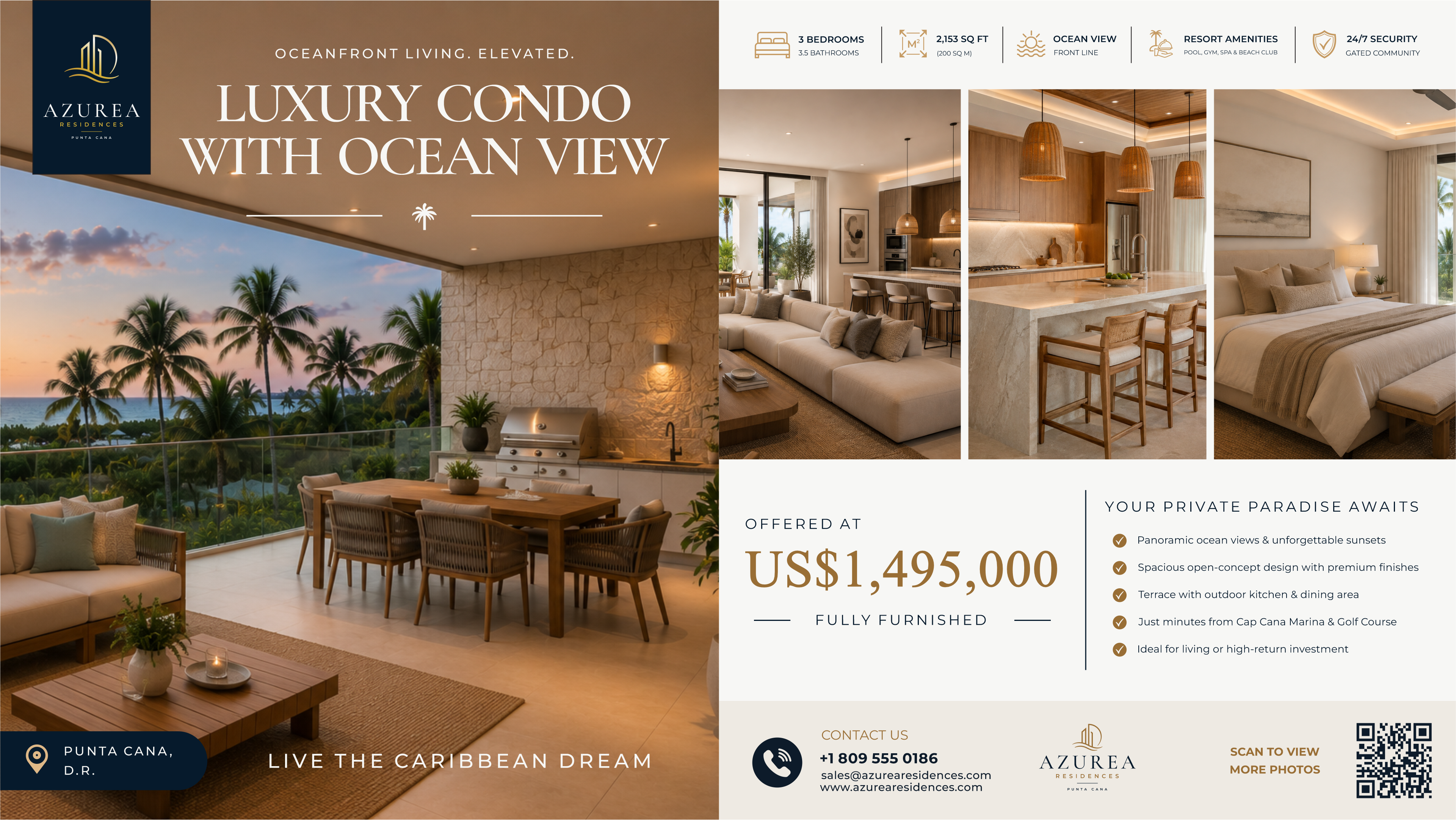
From a detailed property flyer to a tall social composition, the same visual cues keep the collection connected while giving each format its own rhythm.
 View artwork ↗
Space to tell
the whole story.
A fuller editorial composition brings together architecture, interiors, amenities, and a clear call to action.
 View artwork ↗
04 / The wider view
Room for the details.
 View artwork ↗
05 / The digital expression
The same feeling.
A new canvas.
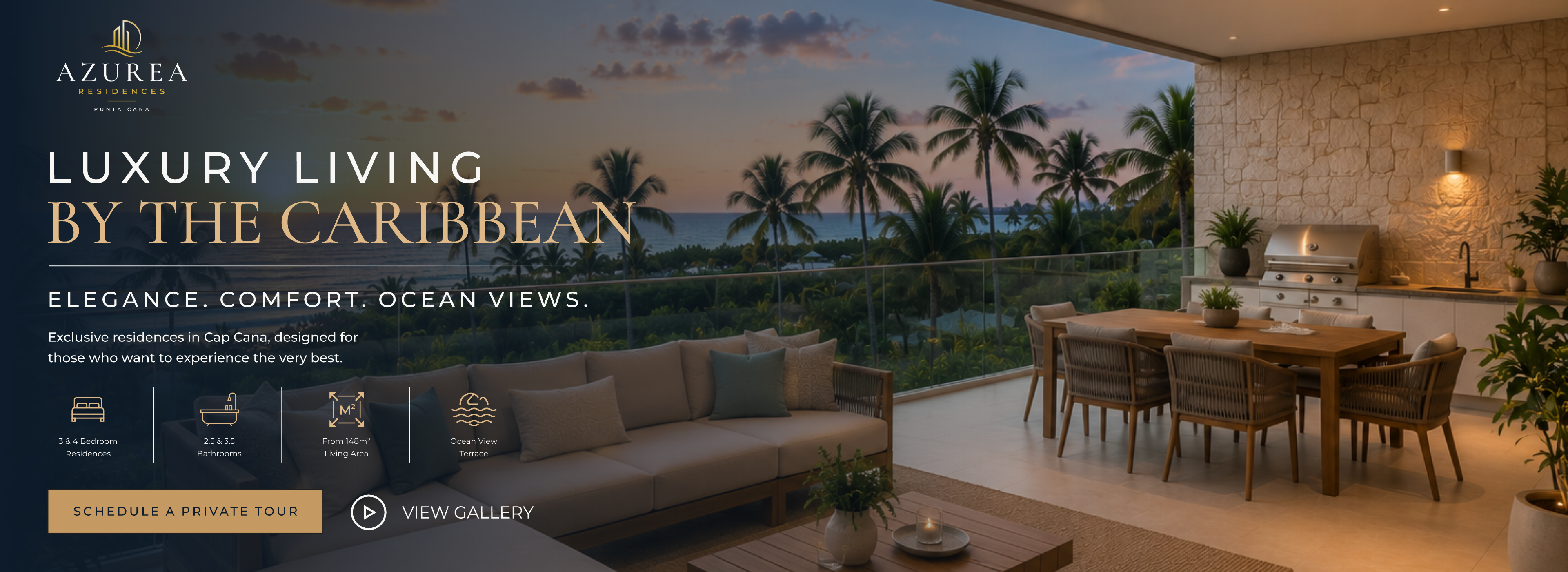
A wide web concept translates the identity into a digital composition, pairing an immersive terrace view with a clear hierarchy of headline, property details, and actions.
 View web concept ↗
Azurea Residences / End of collection
A sense of place.
Across every touchpoint.